QC Forms Designer
QC Results Forms Designer - Introduction
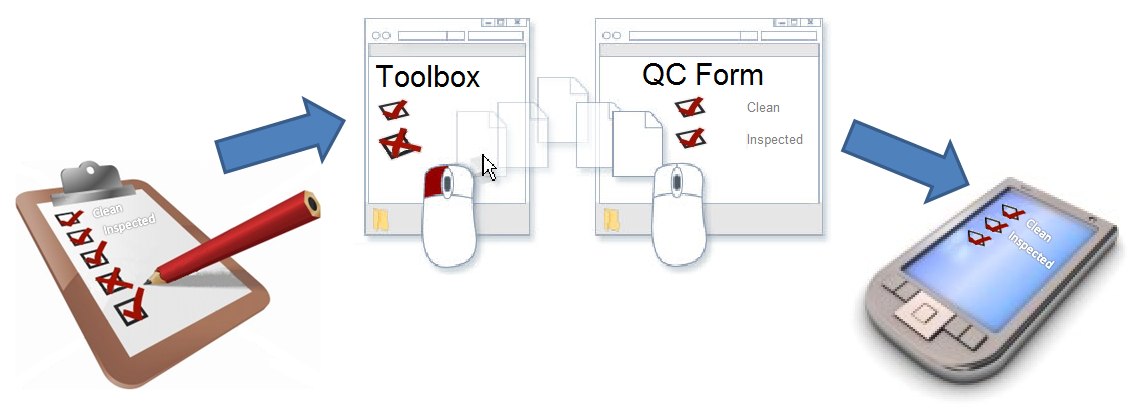
This section describes how to use the QC Results Forms Designer screen found inside Whistle Studio GX. The Forms Designer screen is used to build data collection screens for the QC Results system. It is the same tool we at Coolearth use to develop QC Results screens for our clients. It introduces you to the various components that make up the Forms Designer, and gives instructions for using them.
Building forms for the most part is fairly straightforward. Some controls require a basic grasp of the CoolScript scripting language and how it interacts with the various different types of controls and their properties/methods. Each control and its available set of properties and methods is described in the Control Types section.
After viewing these instructions, you can go to QC Forms - How to Create a QC Form for an example that walks you through creating a new form, and adding controls to it.
Storing the Forms
Screen schema data is stored as Extensible Markup Language (XML) inside the qcScreenSchema database table. Each revision of a screen becomes a separate row in the table. Only one row (revision) per screen can be marked as ‘Active’ at a time, which is the record that is live and downloaded to QC Results clients at log-in time. Using this approach it is easy to either deploy or rollback screen revisions inside a live environment. Each time a user saves a new screen revision, a dialog window collects a comment meant to list and detail any changes that were implemented. This can be useful for auditing screen change information later on. In addition to this feature, the tool also tracks and logs changes that were made through internal programming hooks from within the designer itself. These changes are saved to the qcScreenSchemaAudit table, which can be viewed using the QC Schema Revision Manager screen within Whistle Studio.
Launching the Forms Designer Tool
The Forms Designer tool lives inside Coolearth Studio GX. To access it, the user you log in with will need to be assigned the SD QC FORMS DESIGN permission. This can be done using the User Configuration Tool found under the 'Security' Studio tab.
Once your user has this permission, a screen button named 'QC Forms Designer' will appear under the 'QC Results' Studio tab.
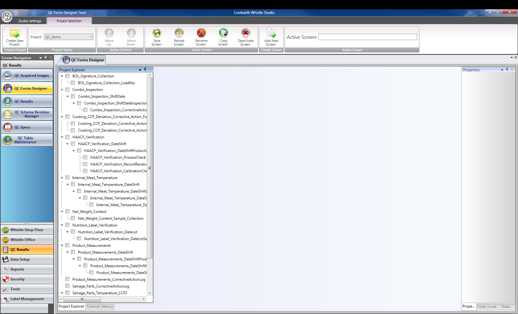
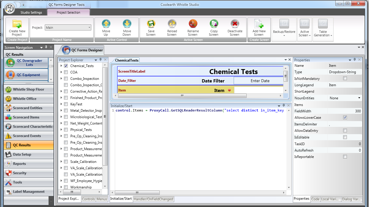
Click this button to launch a new instance of the QC Forms Designer screen. It is possible and sometimes useful to run multiple instances of this screen at once (for instance when copying CoolScript between two different projects). Pictured below is the QC Forms Designer when it first starts up in its initial state:
QC Forms Designer User Interface Elements
The QC Forms Designer tool is made up of several user interface elements. These are described in the following section.
Code Generation Wizards
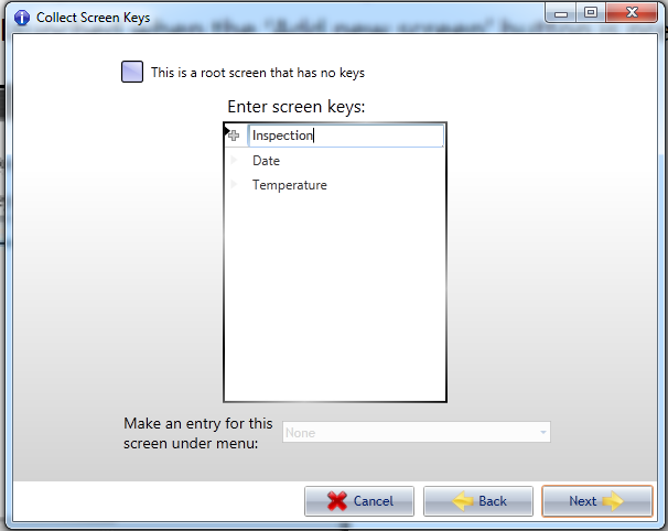
The QC Forms Designer features several CoolScript code generation wizards that can assist the screen programmer in performing many of the common tasks presented while building a screen. For example, a code generation wizard is launched when the ‘Add new screen’ button is pressed.
The purpose of the code generation wizard is to collect answers from the person designing the screen. In this case a new screen is being created so the screen name, keys that make up the backing database table and security permissions necessary will all need to be collected. Once all of the answers have been filled out, the tool will automatically generate the CoolScript and/or screen schema information necessary. As new features are added to the system, new code generation wizards will also be added to support those features.
Project Explorer, Controls and Menus
The tab control on the left is made up of three tab pages that are used for opening and closing screens, adding controls, and manipulating the project menu structure respectively.
Project Explorer
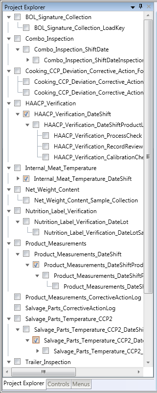
The Project Explorer is primarily used for opening and closing screens, and also as a tool for visualizing the parent-child relationship between the screens contained within your project. Each screen is represented with a check box beside it. To open a screen, click the appropriate screen's check box. Similarly, to close a screen inside the designer, uncheck an open screen's check box.
A hierarchical display of the root screens and their children is displayed within the Project Explorer tree control. As an example, pictured above is the screen HAACP_Verification, which has four descendent screens. It has one child screen named HAACP_Verification_DateShift which also has one child HAACP_Verification_DateShiftProductLine. The screen HAACP_Verification_DateShiftProductLine has three child screens: HAACP_Verification_ProcessCheck, HAACP_Verification_RecordReview and HAACP_Verification_CalibrationCheck. A screen may show up more than once in Project Explorer if it is the child of more than one screen.
For a screen to show up as a parent to another screen, it means it has either a Drill-Down Grid or Form-Link control with its ChildScreen property set to the specified descendent. Setting the ChildScreen property on a Drill-Grid/Form-Link control is described below.
Controls
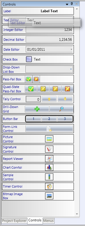
The Controls tab page is for dragging new controls on to the currently active screen. To add a new control to a screen, left click on the type of control you wish to add and drag it over on to the designer surface. As you drag, the tool will display a hint of where the new control will show up if dropped in its current location.
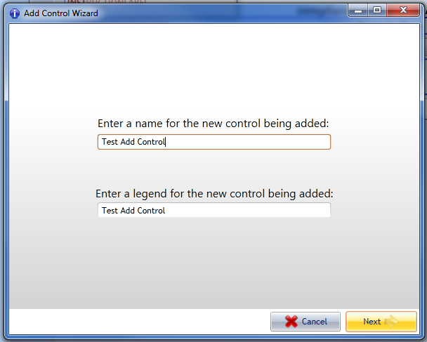
Releasing the left mouse button will drop the control in its current location and initiate the Add New Control dialog wizard.
To complete the Add New Control Wizard, simply fill in a name for the new control you are adding. As you type in the name for the new control, a legend will be automatically generated and used as a default. If you wish to further customize the field legend, use the bottom edit box to adjust the automatically generated text. Control names that contain spaces will be replaced with underscores and cannot contain non-ASCII characters. Choose your control names carefully as they are used as CoolScript control identifiers and when automatically creating backing database columns. To help you enter an acceptable name, the text field background will show green as you type. If you enter an invalid or inappropriate character, it will turn red, signalling a problem. Correct the problem, and it will turn green again.
Once the Add New Control Wizard has been completed, the new control is added to the screen's control collection and displayed on the designer surface.
Don't forget to commit the new changes by clicking the 'Save Screen' button, found on the ribbon bar at the top of the screen, otherwise your changes will be lost after closing the screen. After pressing the button, a dialog box will appear, allowing you to add a comment detailing the changes that were made. All changes to the screen will be saved as a new record in the qcScreenSchema table.
Menus
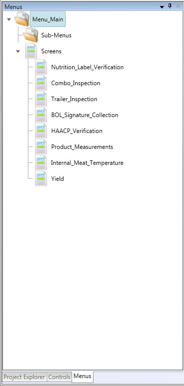
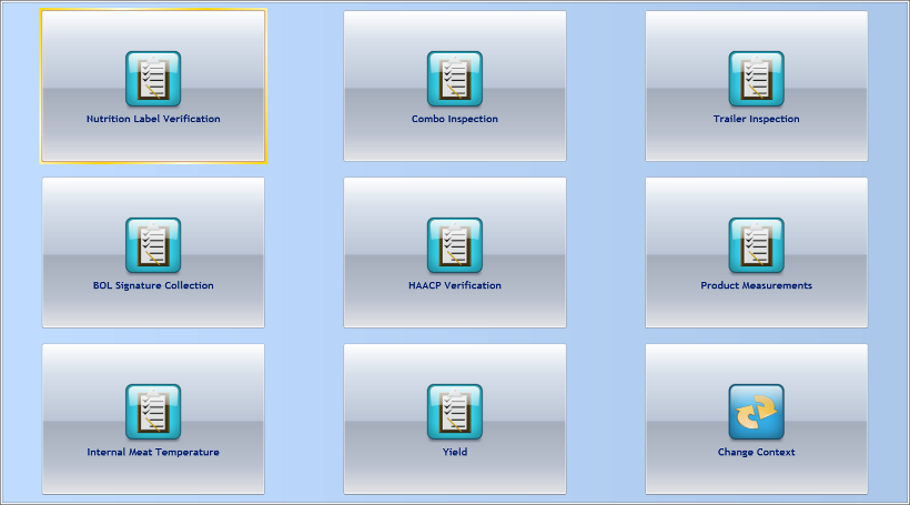
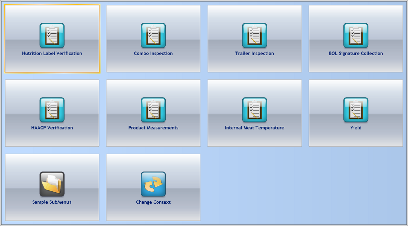
The menu system of the currently selected project can be customized through the use of the Menus tab. Each project has a root menu named Menu_Main which serves as the entry point into the application. The Menu_Main menu screen can contain a collection of menu buttons and/or additional sub menu screens. In this example, QC_Demo project, the Menu_Main screen contains eight menu buttons and no sub-menus. Shown below is the QC_Demo project loaded in the QC Results client.
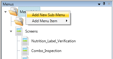
To add a new menu button or a sub-menu, right click on the name of the menu (in this example, Menu_Main) you wish to add to. A context menu will appear as follows:
Adding a Sub-Menu
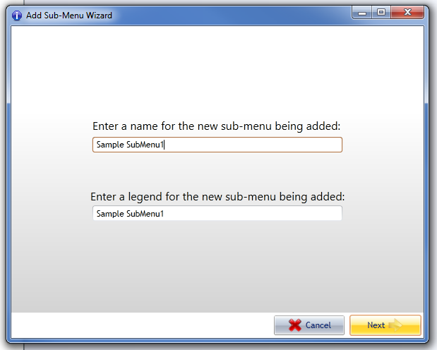
Select the Add New Sub-Menu option to add a nested menu screen. This will start the Add New Sub-Menu Wizard.
Similar to the Add New Control Wizard, this dialog wizard requires you to fill in the name of the new sub-menu. Spaces in the entered menu name will be replaced with underscores and the non-ASCII characters are not allowed. The legend will be automatically generated as the menu name is typed and can contain spaces. The menu legend is the text that will appear on the new menu button that points to the sub-menu. Getting back to this example, notice the new sub-menu button with legend 'Sample SubMenu1' is now present when the project is loaded inside the client:
Adding a new Menu Item
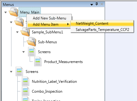
To add a new menu item button to either the Menu_Main root menu screen or to a nested sub-menu, first right click on the name of the menu inside the menu tree control (as described above). When the context menu appears, hover your mouse over the 'Add Menu Item' option for a list of available target screens.
Left click on the name of the screen you wish to make the target of the new menu item. Only screens that have not yet been added to the menu screen will show up in the list of available options.
Properties, Code, Local Variables and Dialog Variables
The tab control on the right is made up of four tab pages that are used for setting screen/control properties, attaching CoolScript code to screens/controls, and defining both local and dialog variables respectively.
Properties
Both controls and screens can have attached attributes that make them function in a certain way. These are known as Control Properties and Screen Properties. Each type of control might have some properties that are specific to how that control works but also some other properties that are common to all controls (such as, the IsNotMandatory property). The control/screen that is currently selected inside the Designer has its properties and code elements displayed inside the Properties tab pane.
Code
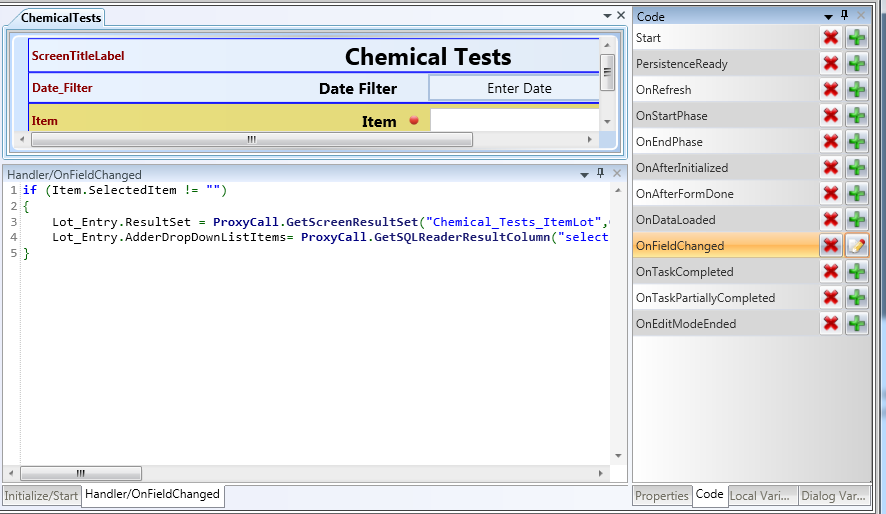
The Code tab in this pane shows you a list of the available coding places for the selected control. In the example pictured above, the screen designer has chosen to add code to run when the field (Item) is changed. The code to run is entered in the coding pane at the bottom of the screen. Each piece of code will be done in its own pane, and will have tabs to move between them. You can see in the example that there are two tabs, showing two different pieces of code for this control, OnStart and OnFieldChanged.
The other tabs in this pane, Local Variables, and Dialog Variables, will rarely be needed.
Return to QC Results

