Control Types
Contents
- 1 Label
- 2 Text Editor
- 3 Pass/Fail Control
- 4 Quad-State Pass/Fail Control
- 5 Check Box Control
- 6 Combo Box
- 7 Date Control
- 8 Form Link Control
- 9 Tally Control
- 10 Drill-Down Grid
- 11 Button Bar Control
- 12 Picture Control
- 13 Signature Control
- 14 Report Viewer Control
- 15 Charts
- 16 Sample Control
- 17 Timer Control
- 18 Time Span Control
- 19 Bitmap Image Box Control
- 20 Gauge Control
- 21 Sample Locator Control
- 22 Status Grid Control
Label
The Label control is used to place a string on the form. This is a read-only field, used mostly for setting the name of the form, or a section of the form.
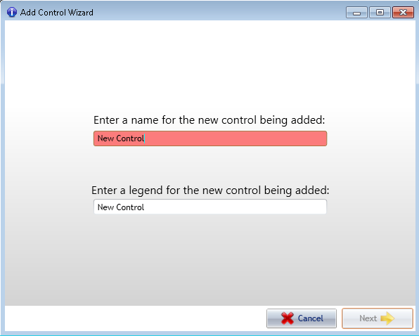
When you select Label from the list of available controls, you will be asked to give it a name. If you type in an invalid name, the text will be highlighted in red. In the example below, a space was put in the name, which is not allowed.
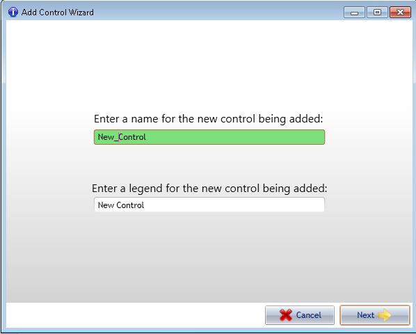
When you fix the problem, in this case by replacing the space with an underline, the text will turn green, which is desired.
The label control will then be added to your form.
After adding the label to your form, you can go to the properties section, and place the text in the Text field that you want to show on the screen, in this case, Label Example (spaces are allowed here).
Text Editor
The text editor control (also known as a textbox) is possibly the most commonly used control in the system. It supports three different modes of data entry:
- Text – The user may enter plain text. This mode does not support constraints.
- Integer – Entry is constrained to integer values. This mode supports constraints.
- Decimal – Enter is constrained to decimal values. This mode also supports constraints.
If the user types in a character that does not parse into a valid numeric value while in Decimal or Integer mode, the keystroke is discarded. Text entered is not validated by any attached CoolScript until the user either leaves the field or hits the Enter key. Negative numeric values are supported.
Pass/Fail Control
The Pass/Fail control is typically used to collect a Boolean value on whether the item being recorded meets standards or not. Pictured above is the Pass/Fail control in its default state. The user either clicks the green button on the right for a value of pass (true) or the red button the left for fail (false). The screen designer can choose to embed CoolScript code in either the pass or fail events for this control. For instance if the user clicks fail, the control can be scripted to launch a linked remediation form (see the Linked Remediation Forms section). Once the user has chosen a value of pass or fail and clicked the appropriate button, a comment box will appear.
The comment text box provides a means to attach addition information to the control’s value. Additionally, the screen designer may opt to make the comment field mandatory for the control to be filled in.
Quad-State Pass/Fail Control
As implied by name, the Quad-State Pass/Fail control is very similar to the regular Pass/Fail control except that there are multiple levels of failure. Instead of a simple Boolean, this control uses an integer to represent its value. The user either clicks the green button the left for pass, or one of the other buttons for failure. The yellow button represents the lowest level of severity increasing from left to right up to the red button representing the greatest severity. Other than that, this control works exactly like the Pass/Fail control described in the section above.
Check Box Control
The Check Box control is very simple control that probably does not need much explanation. One thing to note about the check box control is that it is never mandatory by the very nature of how it works.
Combo Box
The Combo Box is similar to the Text Editor in that it uses a text value. The user is presented with a pre-defined list of values and must select one for the control to be considered filled in.
Date Control
The Date control cab be configured to collect either dates or times. Its value is stored as a datetime in the backing SQL Server database tables. There are couple things to note about this control. The first is the small button that appears to the right of the date editor.
In order to use the Date control to collect Time information only, set the property PickerFormat to either TIME or TIME24HOUR (see QC Forms Designer for more information if needed).
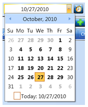
When clicked, this button will set the date editor’s value to the current date/time. When set up to collect dates, rather than typing in the value the user can opt to select a date from the drop down calendar (pictured below).
Form Link Control
The Form Link control is used to break large screens up into smaller pieces. This can be beneficial in several ways. Having smaller more manageable forms is better from a usability standpoint and requires less scrolling. It also helps conserve resources when running on the hand-held platform where processor speed and memory usage is more limited. Loading up a form with 200 controls makes the screen takes longer to load and refresh. Breaking up large forms can also give structure to the form’s workflow. For instance an inspector can be assigned to filling out one section of the form while another inspector is assigned to filling out a different section, making it easy to divide up the work. Using the Form Link control is simple, it is just a button that when clicked will launch a child screen. The text that appears on the button is customizable through CoolScript. The default text and icon displayed indicate the status of the linked child form. In the screenshot above, there is no form created yet. When the user clicks the button they are navigated to the newly created or already existing linked form. From that point on, the Form Link button will be displayed in one of the following three states:
- Incomplete, the linked form is in the partial state and still has mandatory fields that need to be filled in.
- Complete, the linked form is in the complete state, all mandatory fields are filled in but it has not been locked yet.
- Locked, the linked form has been completed and locked. The fields are contained are read-only.
Tally Control
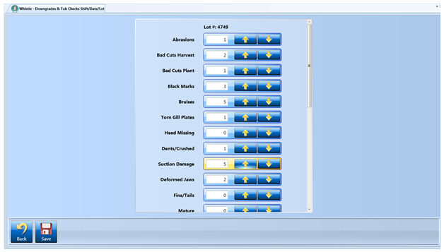
The Tally control is for capturing data in real life scenarios that involve counting something. To illustrate, consider the following screen pictured below:
In this example, the numbers of defects found are being tallied up depending on what category the defects fall under. The value of a tally control is always a whole number – it can never be less than 0. Other than that the Tally control is self explanatory, its value is incremented by clicking the up arrow and decremented by clicking the down arrow. The user also has the option of typing the value in using the numeric edit control.
Drill-Down Grid
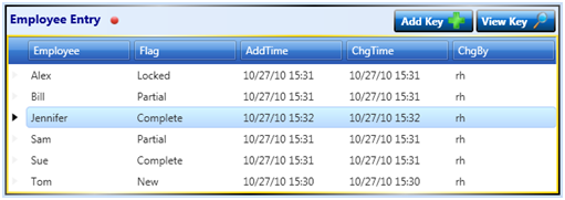
The Drill-Down Grid control is one of the most important controls in the QC Results system because it handles most of the navigation between screens. It represents a one-to-many relationship among parent screens and their children. It differs from the Form Link control in that the Form Link control uses a one-to-one relationship to its child screen. Also, the Drill-Down Grid is used for collecting one or more additional keys that are passed down to the child screen. For instance, in the example above we are collecting employee name as an additional key to be passed down to the next screen.
The user can interact with the Drill-Down Grid in two ways, by either adding a new row (child screen) or viewing/editing an existing row.
Adding a New Row:
By adding a new row, a new instance of the appropriate child screen is created with the keys that are passed down to it. There are two modes for the new row feature, one that requires user input and one that generates a new key value automatically. Which mode it uses depends on the data being collected and how the screen designer decides to set it up. In our example we are collecting employee names so this is not something that can be generated automatically. When the user clicks the ‘Add Key’ button they are presented with the following dialog:
Once the user fills in the text box and clicks the ‘OK’ button, they are navigated to a new child screen with the entered value passed down (in this case the employee name: Bob).
The add key dialog can be configured with one of several different types of editor controls such as date editors, numeric editors or a combo box depending on the type of data being passed down. Notice that the Drill-Down Grid supports the mandatory feature. By default, a mandatory Drill-Down Grid is not considered filled in until it has at least one child row that is in the ‘Locked’ state. If it has more than one row then each additional row must also have a status of ‘Locked’. This is how the QC Results system rolls up the completeness of child screens into their parents. So if a screen has one or more child screens, then they all must be completed and locked before the parent screen can be considered completed and ready to be locked. Viewing an Existing Row When a user clicks on the ‘View Key’ button, they are navigated to the existing child screen that corresponds to the currently selected row in the grid. If the child screen has not been locked, they are free to make changes and/or to complete the rest of it.
Button Bar Control
You can add buttons to your form using the Button Bar control. After adding the control to your form, enter the names of the buttons you want in the Buttonlist property, separated by commas. In the example shown, Start Collection,End Collection was entered.
Picture Control
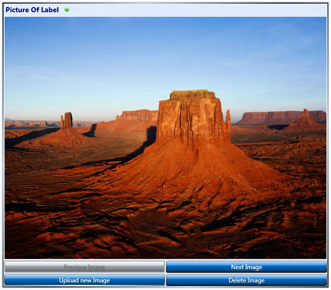
The Picture control is very similar to the control used in the Attach Image Metadata feature. The major difference being that it is embedded as an actual screen control rather than an image that is optionally attached to a field. The mandatory feature is supported, if a Picture control is marked as mandatory then the user must attach one or more pictures for it to be considered filled in. The screenshot above was taken from a screen that is used for collecting images of product labels. Here is what the Picture control looks like after a sample image has been collected:
On the hand-held platform, pictures are taken with the built in camera on the device. For the desktop platform, pictures are uploaded from the user’s hard drive.
Signature Control
You can collect signatures on your form by adding a Signature Control. A person will use a stylus to add their signature to your form, and that signature will be stored in the database record for that form.
Report Viewer Control
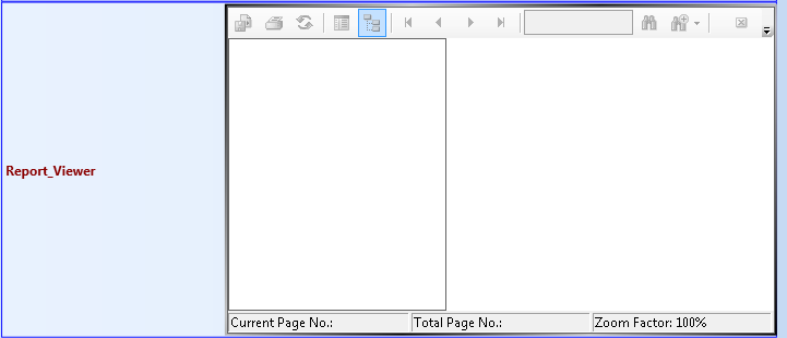
The Report Viewer Control allows you to view reports on your forms. Enter the report you wish to view in the ReportSource property of the control.
Charts
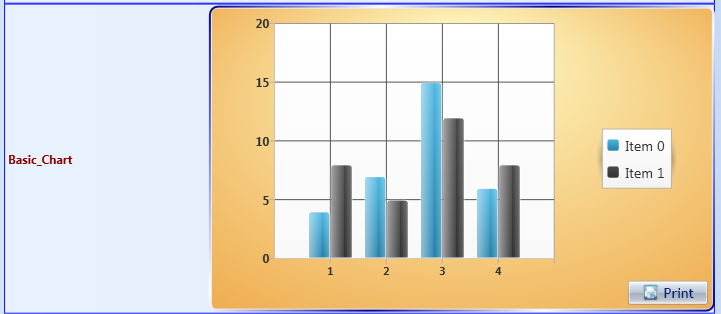
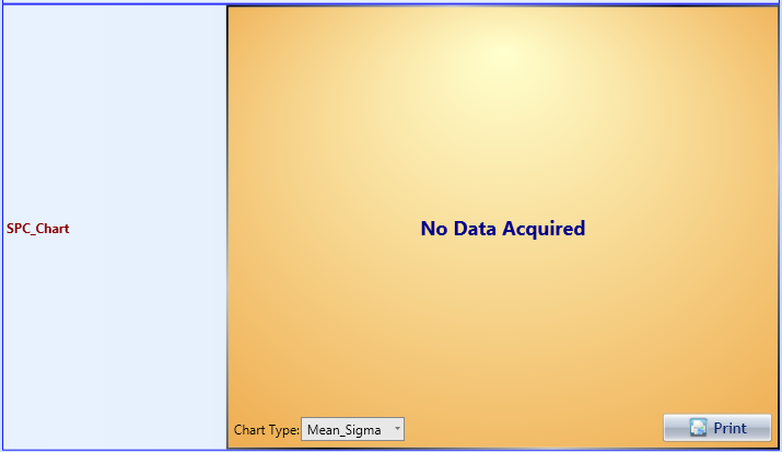
There is a wide variety of chart controls available in QC Results, allowing you to select the one that best suits the form you are creating. Using the Properties, you can set the title of the chart, put labels on the axis, specify the information to be displayed, and change display aspects of the chart.
Basic Chart Control
Variable Control Chart
Pareto Diagram
SPC Chart Control
Sample Control
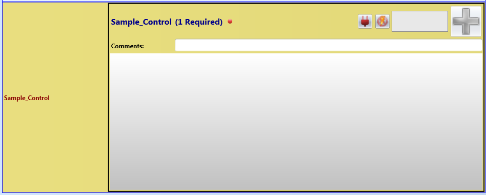
The Sample Control is used for taking samples. It can receive information from connected equipment, such as scales, thermometers, or temperature probes, or the data can be manually entered. When you set up the control, you use the Properties section tailor the control to the specific sampling this form is to be used for, whether that is weight or color, pH or pressure, and many other choices. You can set the equipment type to indicate the type of sample data you want to collect (string, integer, decimal, etc.), the device it is to connect to, among other things. The power indicator will tell you if the connected device is active (green) or if manual entry is enabled (red). The button next to it is an indicator whether or not the device the form is attached to is calibrated or not. If the form is not attached to a device, this button is not shown.
Timer Control
The Timer Control allows you to perform a task or series of tasks at a specified interval, or to wait for a specified length of time before performing some action.
Time Span Control
The Time Span Control will collect information at specified intervals, much like the Timer Control.
Bitmap Image Box Control
Gauge Control
This control is used to show values on a scale that has minimum and maximum values. Using the Properties, you can set the start and end values for the scale, and the range between values to set up the rest of the scale.
Sample Locator Control
Status Grid Control
Return to QC Results

