Difference between revisions of "GX:Category:General Operating Instructions"
| Line 14: | Line 14: | ||
The application menu is accessed by clicking on the small circular area containing the Coolearth icon in the top left corner of the window. General application level options can be found here. | The application menu is accessed by clicking on the small circular area containing the Coolearth icon in the top left corner of the window. General application level options can be found here. | ||
| − | + | ==== Window Theme ==== | |
The window theme affects the visual style used by the major UI components found inside Whistle Studio such as the ribbon, the navigation bar, content panes, tab groups and table maintenance grids. There are several themes to choose from including standard ones like those found in Microsoft Office and Windows XP. | The window theme affects the visual style used by the major UI components found inside Whistle Studio such as the ribbon, the navigation bar, content panes, tab groups and table maintenance grids. There are several themes to choose from including standard ones like those found in Microsoft Office and Windows XP. | ||
| − | + | ==== Controls Theme ==== | |
The controls theme applies to the component controls found inside Whistle Studio such as buttons, check boxes, text fields, combo boxes and expanders. If you wish to simply let the controls use whatever your default windows theme is set to (ie: under Windows Vista-Aero, under Windows XP-Luna), select "Default Windows Theme". | The controls theme applies to the component controls found inside Whistle Studio such as buttons, check boxes, text fields, combo boxes and expanders. If you wish to simply let the controls use whatever your default windows theme is set to (ie: under Windows Vista-Aero, under Windows XP-Luna), select "Default Windows Theme". | ||
| − | + | ==== Logout ==== | |
To log out of Whistle Studio and return to the login screen use this menu option. | To log out of Whistle Studio and return to the login screen use this menu option. | ||
| − | + | ==== Exit ==== | |
To exit the application use this menu option. | To exit the application use this menu option. | ||
| Line 38: | Line 38: | ||
Ribbon tab items are a way to organize all the various toolbars found throughout Whistle Studio. There are two types of ribbon tab items. | Ribbon tab items are a way to organize all the various toolbars found throughout Whistle Studio. There are two types of ribbon tab items. | ||
| − | + | ==== Regular Ribbon Tabs ==== | |
A regular ribbon tab is a always available and generally contains tools that are useful at the application level. That is to say that the tools contained are more general purpose in nature and don't apply to specific screen. The "Studio User Context" tab is an example of a regular ribbon tab. | A regular ribbon tab is a always available and generally contains tools that are useful at the application level. That is to say that the tools contained are more general purpose in nature and don't apply to specific screen. The "Studio User Context" tab is an example of a regular ribbon tab. | ||
| − | + | ==== Contextual Tab Groups ==== | |
Contextual tab groups are found all throughout Whistle Studio and expose tools that are specific to each screen. A contextual tab group can contain more than one actual tab, but usually do not unless there are a large number of tools to display and not enough horizontal screen real estate to accommodate them all. Only one contextual tab group is visible at any given time. When a screen gets activated, its contextual tab group becomes visible and the previously active screen's contextual tab group is hidden. An example of a contextual tab group is the 'Primary Tools' tab group seen in the screen shot above. | Contextual tab groups are found all throughout Whistle Studio and expose tools that are specific to each screen. A contextual tab group can contain more than one actual tab, but usually do not unless there are a large number of tools to display and not enough horizontal screen real estate to accommodate them all. Only one contextual tab group is visible at any given time. When a screen gets activated, its contextual tab group becomes visible and the previously active screen's contextual tab group is hidden. An example of a contextual tab group is the 'Primary Tools' tab group seen in the screen shot above. | ||
| Line 58: | Line 58: | ||
The studio navigation bar is similar to the control used inside Microsoft Outlook. This is the mechanism Whistle Studio uses to launch new screen instances. | The studio navigation bar is similar to the control used inside Microsoft Outlook. This is the mechanism Whistle Studio uses to launch new screen instances. | ||
| − | + | ==== Auto Hide / Navigation Pane Style (Window Position) ==== | |
| − | + | ===== Auto Hide ===== | |
Click on the thumb tack icon to put the navigation bar into auto hide mode. This option is useful hiding the navigation bar when it is not being used, thereby maximizing more horizontal screen real estate for use by actual screens. In auto hide mode, the navigation bar becomes collapsed into a vertical tab on the left side of the screen. When the user clicks or hovers over the vertical tab, the navigation bar slides into view. Once Whistle Studio determines the user is no longer interacting with the navigation bar control, it slides back out of view. | Click on the thumb tack icon to put the navigation bar into auto hide mode. This option is useful hiding the navigation bar when it is not being used, thereby maximizing more horizontal screen real estate for use by actual screens. In auto hide mode, the navigation bar becomes collapsed into a vertical tab on the left side of the screen. When the user clicks or hovers over the vertical tab, the navigation bar slides into view. Once Whistle Studio determines the user is no longer interacting with the navigation bar control, it slides back out of view. | ||
| − | + | ===== Navigation Pane Style (Window Position) ===== | |
The small down arrow icon can be used to select the way navigation bar is displayed. Dockable is the default setting, meaning that the control will try to dock itself inside the main window make and the rest of the main window's contents share space with it. The user can grab on to the control Floating | The small down arrow icon can be used to select the way navigation bar is displayed. Dockable is the default setting, meaning that the control will try to dock itself inside the main window make and the rest of the main window's contents share space with it. The user can grab on to the control Floating | ||
Revision as of 19:24, 3 February 2010
Basics
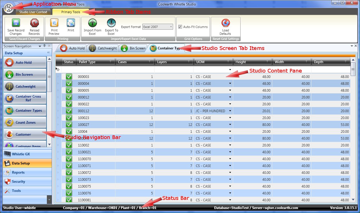
Whistle Studio is designed to be simple and intuitive for the end user to operate. It uses a combination of user interface elements similar to those found in Microsoft Office. To navigate and launch new screens, the Outlook style navigation bar is used. To perform tasks and access tools inside of individual screens the Excel/Word style ribbon interface is used. Management and layout of open screens uses a Microsoft Visual Studio like interface.
The Application Menu
The application menu is accessed by clicking on the small circular area containing the Coolearth icon in the top left corner of the window. General application level options can be found here.
Window Theme
The window theme affects the visual style used by the major UI components found inside Whistle Studio such as the ribbon, the navigation bar, content panes, tab groups and table maintenance grids. There are several themes to choose from including standard ones like those found in Microsoft Office and Windows XP.
Controls Theme
The controls theme applies to the component controls found inside Whistle Studio such as buttons, check boxes, text fields, combo boxes and expanders. If you wish to simply let the controls use whatever your default windows theme is set to (ie: under Windows Vista-Aero, under Windows XP-Luna), select "Default Windows Theme".
Logout
To log out of Whistle Studio and return to the login screen use this menu option.
Exit
To exit the application use this menu option.
Ribbon Tab Items
Ribbon tab items are a way to organize all the various toolbars found throughout Whistle Studio. There are two types of ribbon tab items.
Regular Ribbon Tabs
A regular ribbon tab is a always available and generally contains tools that are useful at the application level. That is to say that the tools contained are more general purpose in nature and don't apply to specific screen. The "Studio User Context" tab is an example of a regular ribbon tab.
Contextual Tab Groups
Contextual tab groups are found all throughout Whistle Studio and expose tools that are specific to each screen. A contextual tab group can contain more than one actual tab, but usually do not unless there are a large number of tools to display and not enough horizontal screen real estate to accommodate them all. Only one contextual tab group is visible at any given time. When a screen gets activated, its contextual tab group becomes visible and the previously active screen's contextual tab group is hidden. An example of a contextual tab group is the 'Primary Tools' tab group seen in the screen shot above.
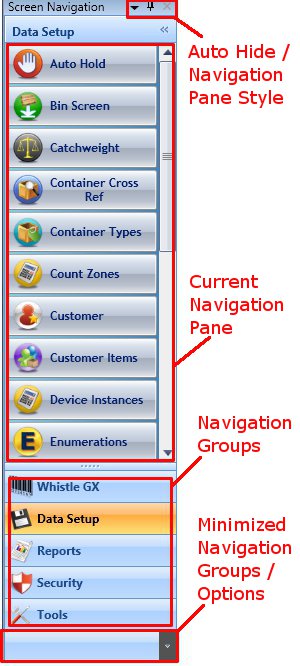
The studio navigation bar is similar to the control used inside Microsoft Outlook. This is the mechanism Whistle Studio uses to launch new screen instances.
Auto Hide
Click on the thumb tack icon to put the navigation bar into auto hide mode. This option is useful hiding the navigation bar when it is not being used, thereby maximizing more horizontal screen real estate for use by actual screens. In auto hide mode, the navigation bar becomes collapsed into a vertical tab on the left side of the screen. When the user clicks or hovers over the vertical tab, the navigation bar slides into view. Once Whistle Studio determines the user is no longer interacting with the navigation bar control, it slides back out of view.
The small down arrow icon can be used to select the way navigation bar is displayed. Dockable is the default setting, meaning that the control will try to dock itself inside the main window make and the rest of the main window's contents share space with it. The user can grab on to the control Floating
Several Navigation

